Brainstorm of Topic
We received the topic ‘The meeting of ocean and land’, and first went about brainstorming how we could represent this using space.
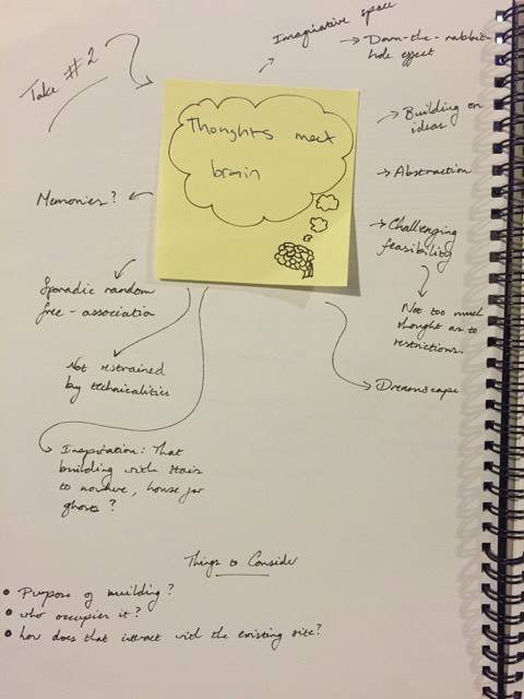
We couldn’t think of anything, so instead created a mindmap of exactly what meanings we connote between ‘land’ and ‘ocean’. By creating a more abstract notion of this meeting through their connotations, we were able to come up with a lot more in terms of ideas.
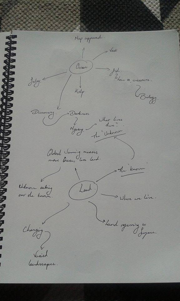
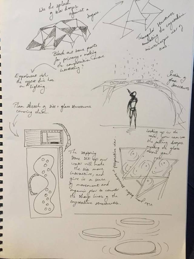
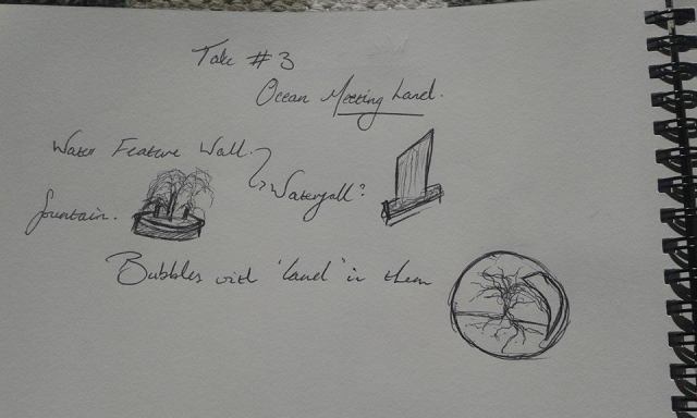
We decided to take the route of showing the meeting of ‘land’ and ‘ocean’ as a metaphor for the meeting of the known and the unknown. This led us to wanting to represent the mystery between that meeting, and the transition between the two themes.
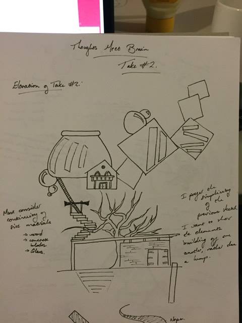
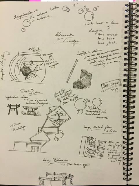
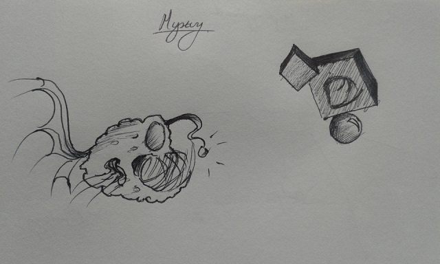
Initial Sketches of Ideas
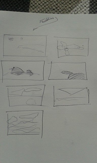
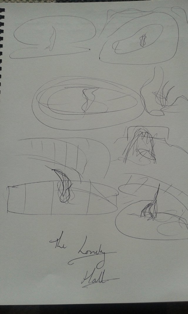
We initially wanted to take the route of displaying geometrical shapes around the site reminiscent of fish tanks, showing silhouettes of creatures within them that were unidentifiable.
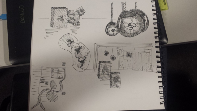
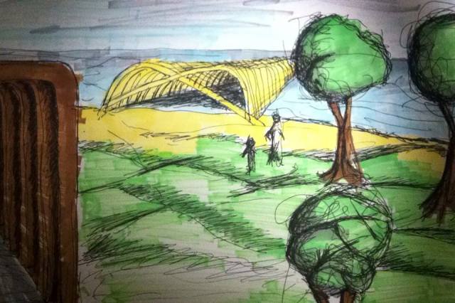
We thought this may be too ambitious for the time frame within which to submit – we were a group made of people who missed the first class of the week. Instead, we decided to work with these designs drawn by Gwyn Jones, based on original designs by Blair George:
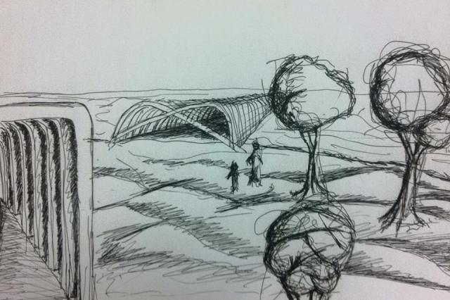
Research
Seeing as we had already come up with the design to be translated into sketch up, it made most sense to research into the structure of the whale bones leading into the sea. This research could then be implemented into texturing the model, or in creating an accurate shape of the arches.


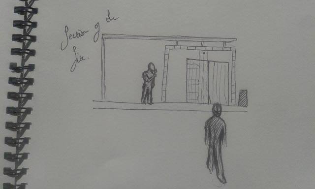
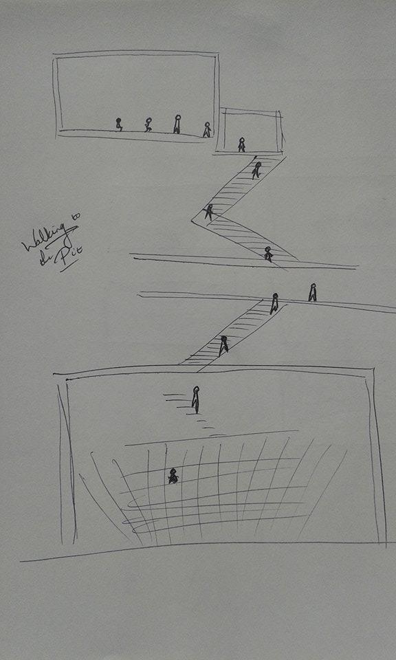
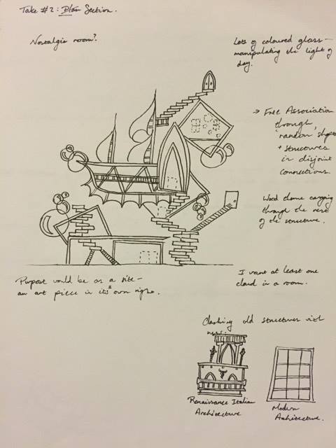
Final Images of Take #2: Plan/Section/Elevation
The following are some images from the Sketchup model, rendered using Indigo, then Photoshopped to situate them in an environment.


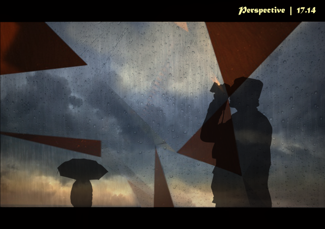
For a change, here are some perspective images of the site take from Twinmotion.


Twinmotion Tests
We didn’t create quite as many as required, mostly due to the lifetime it takes to export shots from twinmotion onto a USB.
Please excuse the quality, we pay $35 monthly at the cube for internet for our downloads to look like this.