Straight Line Practice
Drawing Challenges


We received the topic ‘The meeting of ocean and land’, and first went about brainstorming how we could represent this using space.
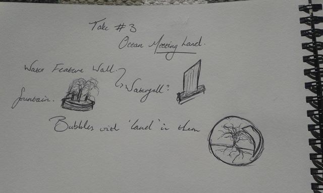
We couldn’t think of anything, so instead created a mindmap of exactly what meanings we connote between ‘land’ and ‘ocean’. By creating a more abstract notion of this meeting through their connotations, we were able to come up with a lot more in terms of ideas.
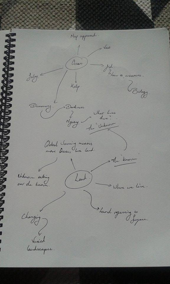
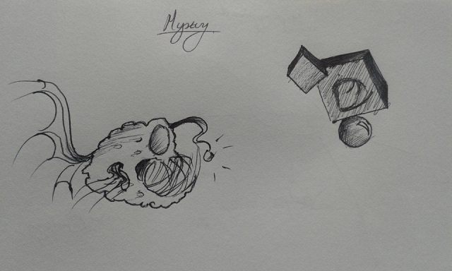
We decided to take the route of showing the meeting of ‘land’ and ‘ocean’ as a metaphor for the meeting of the known and the unknown. This led us to wanting to represent the mystery between that meeting, and the transition between the two themes.
We initially wanted to take the route of displaying geometrical shapes around the site reminiscent of fish tanks, showing silhouettes of creatures within them that were unidentifiable.
We thought this may be too ambitious for the time frame within which to submit – we were a group made of people who missed the first class of the week. Instead, we decided to work with these designs drawn by Gwyn Jones, based on original designs by Blair George:
Seeing as we had already come up with the design to be translated into sketch up, it made most sense to research into the structure of the whale bones leading into the sea. This research could then be implemented into texturing the model, or in creating an accurate shape of the arches.


The following are some images from the Sketchup model, rendered using Indigo, then Photoshopped to situate them in an environment.


For a change, here are some perspective images of the site take from Twinmotion.


We didn’t create quite as many as required, mostly due to the lifetime it takes to export shots from twinmotion onto a USB.
Please excuse the quality, we pay $35 monthly at the cube for internet for our downloads to look like this.

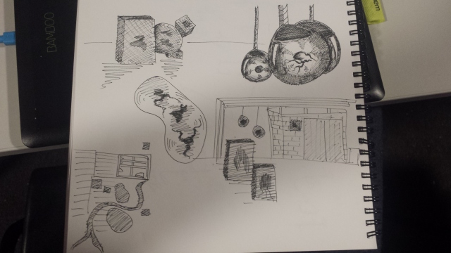
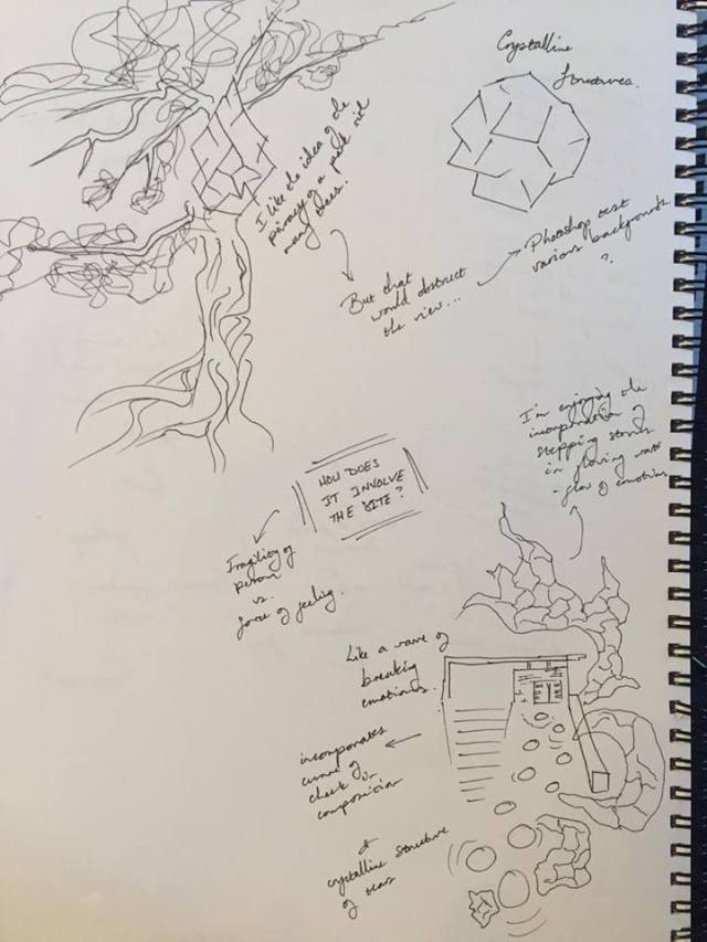
My topic of choice from the post-it notes on the window was ‘the meeting between tears and the cheek.’ I wanted to move away from what I believed to be the obvious route – making a structure based off the emotional connotation of tears, and the kind of site that would be associated with it. Instead, I tried to think of the physical meeting between tears and the cheek, considering the curving and organic shapes, the transition between creation and destruction, the movement involved, and so forth.
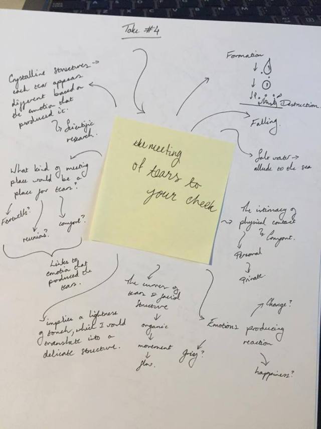
I remember once reading about how each tear contains a unique crystalline structure which changes depending on the emotion that produced it – I believe this to be due to a reaction with the hormones which alter the structure of the tear. A photography project by Rose-Lynn Fisher entitled ‘The Topography of Tears’ shows photographs of different types of tears, which I wanted to adopt for my structure on the site.


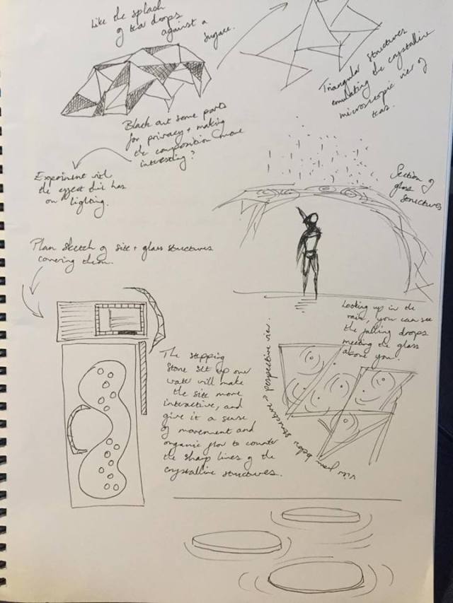
I want to incorporate the crystalline structures of the different types of tears into sculptural shelters of sorts made from glass around the site. I found it fascinating to think how the violent, explosive nature of tears photographed in this manner emulate the forcefulness of the emotions that produce them. As such, I wanted to use similar shapes for my sculptural elements, reminiscent of a wave breaking to continue the metaphor.
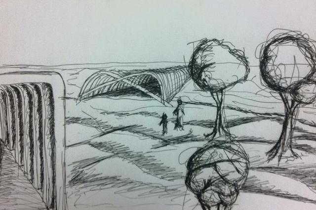
Expanding on my conclusions drawn from research and the thoughts considered in my brainstorm, I experimented with ideas and sketches to consolidate my ideas.
I was glad that this time I was able to make the final model so similar to the plan drawings. My confidence with SketchUp has really improved over the past few weeks, which has enabled me to realise more complex designs. It was still monstrously irritating to try and create geometry which didn’t follow axes though.


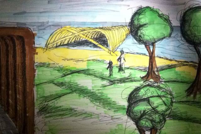
Anyhoo, I’m happy with this, although a little worried that the monochromatic colour scheme and glass is too reminiscent of ice, which wasn’t quite what I was going for. I wanted to put some warmer mood lighting in my rendered images, and possible more ambient setting and colours through Photoshopping the renders.
These are the images I’ll be printing off for peer review on Tuesday.


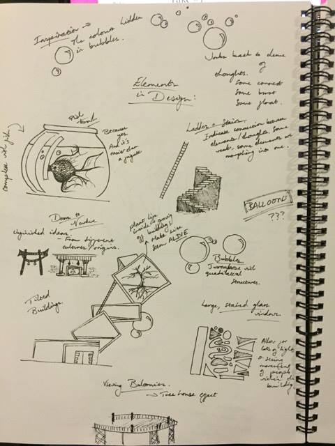
My topic was the meeting of thoughts and the brain. I wanted to take a more emotive approach to the work rather than a scientific one, since my group’s take #1 drew inspiration from the double helix structure of DNA. My brainstorm reflects the process of inspiration, and how I could structurally represent the connections of thoughts in space.
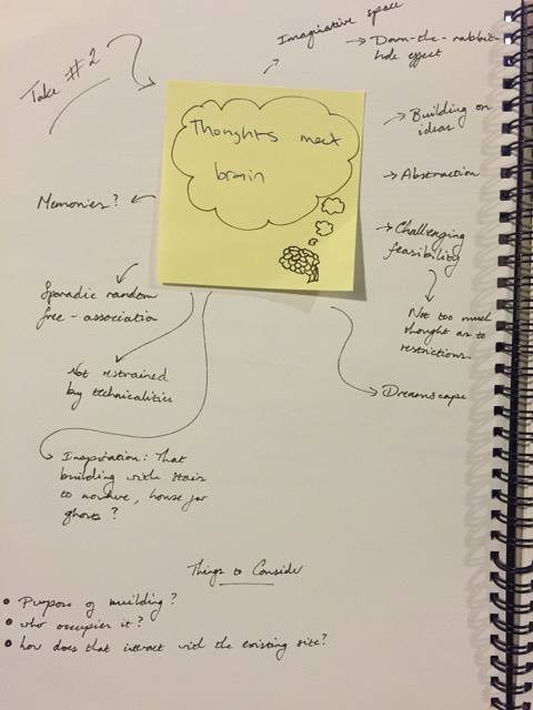
These sketches were generated with more of a sculptural consideration than an architectural one. The structure is impossible in that it wouldn’t be able to practically support itself in the way I have designed it, although I didn’t want feasibility to limit what I would be able to design seeing as it’s not required. I aimed for the space to be experienced in a similar way to visiting an art gallery, only the space is the main feature of the work as opposed to what it houses. This will allow me to explore the theme of light manipulation within the space freely.
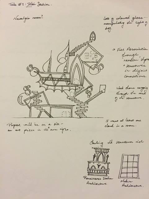
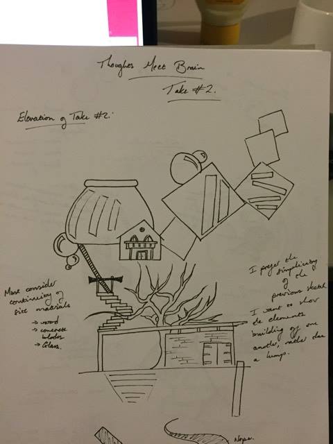
The theme surrounding my work on take #2 is the idea of thoughts building on one another, translated into structures of different shape, materials and context connected by varying distances. The distances and methods of connecting these structures reflect how some ideas feel distantly or weakly connected – represented by structures such as a ladder – or merge into one form.
I worry about how I will be able to create this using sketchup, but again, I didn’t want that to be a limitation in my thought process. Being confident in Photoshop means I’m not all too worried about it.
My research in the Massey Library led me to find 2 books looking into architecture and the mind:


The first book, Chambers for a Memory Palace by Donlyn Lyndon and Charles W. Moore, was a particularly good resource for challenging the limits of architecture in order to create a space which represents the possibilities within the thought process. The many sketches of real and imagined spaces was interesting in showing the conception process for their creation.


The below images were less useful for my research specifically for take #2, I just really appreciated the simplicity of the sketching style in capturing the sense of the depicted spaces. The sketches follow a very similar en plein air approach to our outing to Te Papa, and I was extremely taken with how very few lines and low precision can so brilliantly convey atmosphere.


Considering the design ideas presented in my research, I did some sketches to develop my ideas further and work out fine points of elements I wanted to include.

I attempted to create a model based on the sketch I did in my developmental stages of design. I quickly realised that the design was far too ambitious, was taking me far longer than it needed to, and looked messy when visualised in 3D.


I decided to simplify what I was working with, and focus on rearranging the elements that I liked within the model. The tree and its positioning within the building was an element I decided to focus on within the model, which was then rendered using Indigo. I then put them through Photoshop to situate them in an environment, add people for scale, and add some contrast to the images. The following exhibits elevation, 3 perspectives, plan and section drawings of my work, respectively:


I feel like I’m slowly improving on this front – particularly looking back at my drawing practice from Week 1.

I could have sown more layering of the different textures and materials in the ground and water separation. I feel that would have made the drawing look more like a section study and less like perspective.
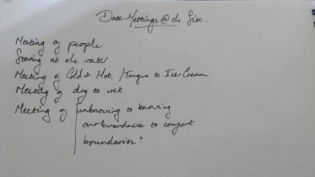
We picked the theme of a date ‘meeting’ within the site, and brainstormed around what could be meeting in a site like that, and how we could translate that into physical space.

Throughout our group discussions wherein we all shared our ideas on how the brainstorm would logistically fit with the site, I created sketches of the combined ideas as they changed and developed. This allowed us a point of reference to build our ideas on, and which the other team members would be able to use as visual references for their individual parts of the sketch-up work.
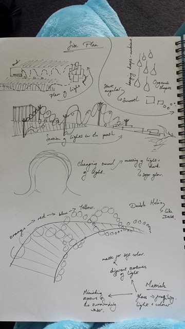
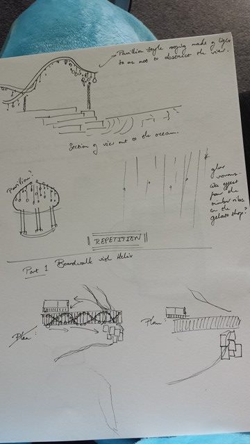
The basic idea here communicated would be that we would create a double-helix of light encasing the site and creating a short walkway. This was to reflect the meeting of individuals, through a reflection of DNA. The lights would reflect the transition between awkwardness to comfort, in the material from which they were made, their shapes, and colour. The walkway effect leading into the site would show this transition by starting with awkward angular shapes and more garish lighting, settling into softer organic shapes with soft lighting as it eases into comfort. This interacts with the actual site, considering the gelato shop is a place where in a date, people would follow through this transition in the process of getting to know each other.
The group researched the emotional connotations of colours of the colour wheel, which would be shone through the lighting and reflect the awkwardness/comfort transition. These have been annotated across the notes above.
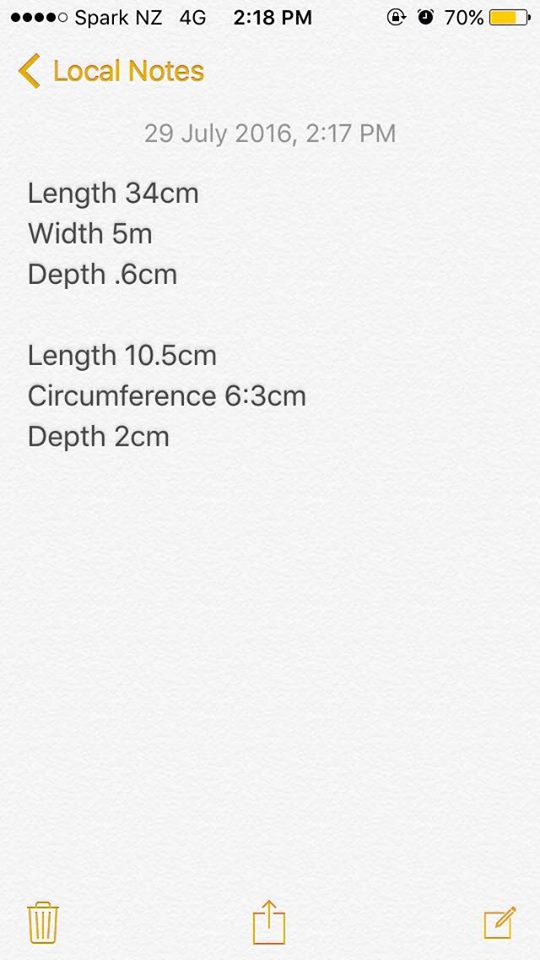
Luca Rosseels offered to do the work on the detail from the actual site to add into our model, and Bobbie Grant went to the physical site to take the measurements for him to model. We chose to model the metal hinges on the door of the gelato shop.
And the above video is the work Luca did to show the group his model for the thumbs up.
Mitchell Nash did the above model of the double-helix over the site, and showed the group the above video to ask for feedback. Bobbie would be changing the interior on sketch-up to integrate our ideas throughout the site. After the sketch-up work of the other 3 members had been completed, we planned to meet and combine the models into a single file. I would take this file home, and take screenshots of the plan, section, elevation and perspective views of our modified site. Beyond this, I would finalise the views by adding people for scale and ambient light through Adobe Photoshop.


I feel I have really grasped the differences between plan, section, perspective and elevation drawings. It still feels unnatural putting shadows in the place of perspective in the majority of my sketches to indicate depth, although I’m sure I’ll become used to it soon enough. In order to compensate for the lack of the perspective, I recognise that I need to become more bold with my use of shadow and the differences between lines to indicate depth instead.
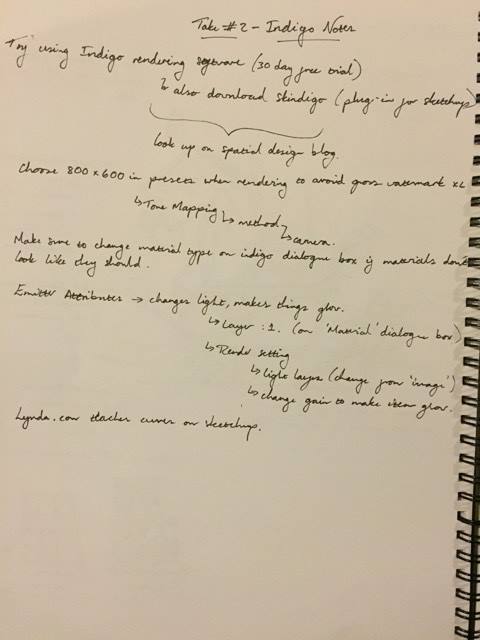
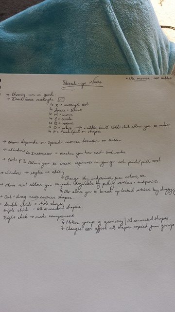
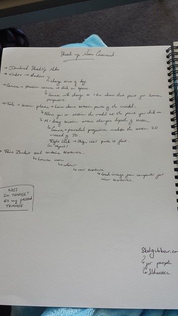
The following shows my notes on hotkeys and things to remember while using software, based on the 30 minute video on the Spatial Design blog, and from the in-class presentation.

I went back to the site to complete the site analysis at a time when the lighting could produce better photographs to capture the elements of the environment.


I was quite taken with the washed out quality the light gave the colours, which contrasted quite dramatically with the sharp diagonal shadow which it cast from the structures. It makes it really clear why the wooden ribs on the Freyberg gelato shop make it such an interesting subject – it manipulates the light within the structure.


")


The relationship between the faded wood and surrounding concrete was interesting in the similarity of the colours, and how it made the site fit in with both the seascape and the city behind it. I also thought it would be interesting to take a detail sketch of the gravelly stone which made up the waterbreaker, both as a sketch of the positive aspect of the stone, and a rubbing of the negative spaces the texture created.
In my video as well as those that I saw on other students’ blogs, the thing that most stood out to me was the battering sound of the wind against the camera microphones. It drowns out much of the visual aspects of the videos to me, so I wanted to create my visual response in reaction to violence of the wind.


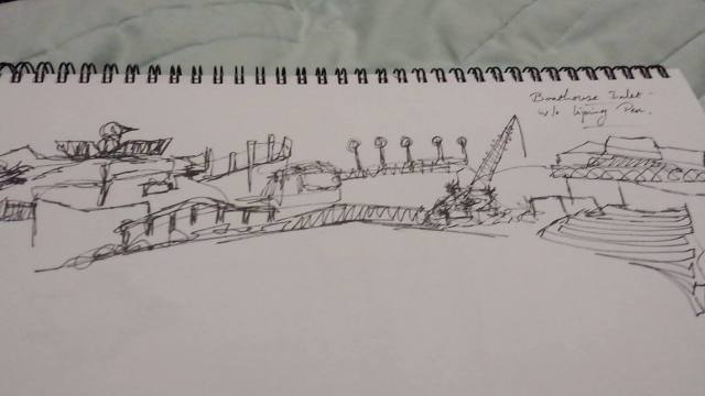
(Above) Sketch of the scenery in the photograph, en plein air.


(Above) First two photographs depict the area that was drawn as a panorama sketch below. The panorama was not too successful, most probably because I didn’t map out the extremities of the sketch before I started to draw from left to right. This may also have limited what could be done by the person who took over from me on the right half of the sketch.
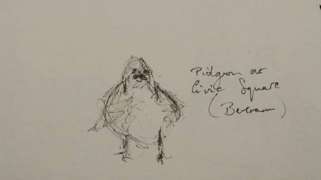
(Above) Extra photograph. I liked the silhouettes the birds made against the light.
 (Above) Sketch made without lifting pen from paper.
(Above) Pencil sketch trying to capture the texture of the water.
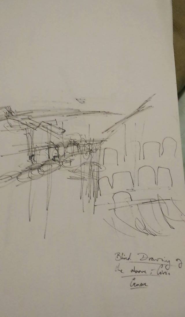


(Above) Sketch versus photograph of the interior of Te Papa. This panoramic scene was more effective than my previous one, because I defined the borders of the sketch before adding detail – this shows because I wasn’t able to fully capture the sketched scene in a single frame of photo. Needs work on portraying perspective, and refinement of straight lines.
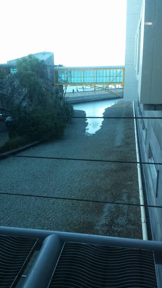
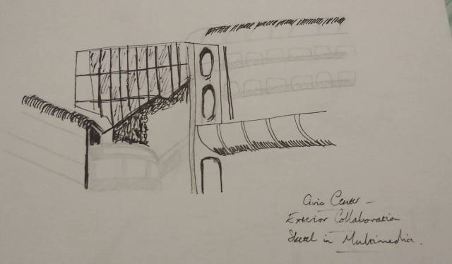
(Above) Photograph of the exterior of Te Papa from the interior. I liked the shape of the walkway and the cool light in the photo.


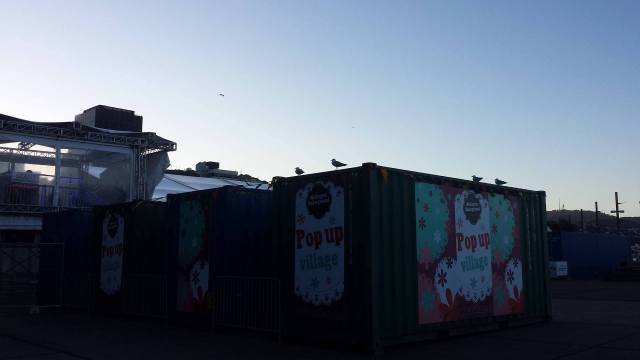
I was away from class, and made a point to go back to the site to take photographs and complete the site analysis. However, by the time I arrived, it was too dark to take quality material from the site. The above photographs turned out very grainy and didn’t display the textures and angles of the site which I found interesting. I will return this week to complete the site analysis and work more in-depth.
